

Landing Page Teardown That Boosted Lead Sign-Ups
Most landing pages don’t fail because of one big mistake. They fail because of five small ones stacked on top of each other a vague headline, a form that asks too much, and a CTA that says “Submit.” Here’s a quick teardown of a real landing page redesign that took sign-ups from mediocre to double. If you’re new to improving conversions, start with our guide on <a href=”https://pixicondigital.com/landing-page-optimization/”>landing page optimization</a>, then use the framework below to audit your own page in under an hour.
The Before: What Was Holding It Back
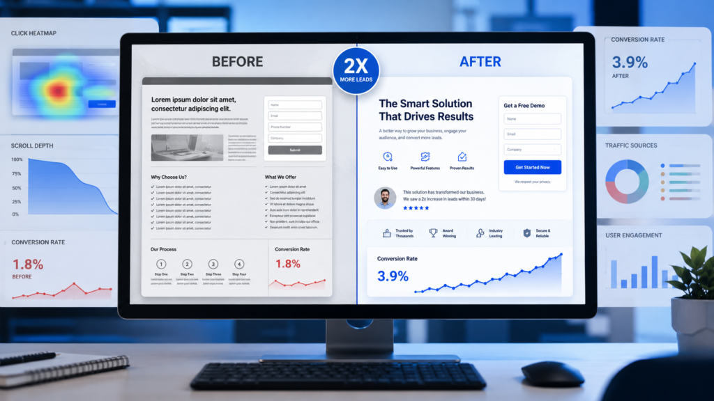
The original page had the basics in place a hero section, a form, some feature bullets but it was quietly leaking conversions in four places:
- Vague headline. “Manage Your Team Better” told visitors nothing about what the product actually did or who it was for.
- A seven-field signup form. Name, company, role, phone number, team size, industry, and email before anyone had seen enough value to justify that much effort.
- Generic CTA copy. The button said “Submit,” which asks for commitment without offering a reason.
- No trust signals above the fold. No logos, testimonials, or numbers just a claim and a form.
The After: What Changed
- Headline rewritten for clarity and specificity: “Cut Your Team’s Status-Update Time by 80%” a real, quantified outcome instead of a vague benefit.
- Form cut from 7 fields to 2: just email and company name. Everything else moved to onboarding, after the visitor was already committed.
- CTA changed from “Submit” to “Start My Free Trial” action-oriented, ownership language, no ambiguity about what happens next.
- Trust signals added above the fold: three recognizable customer logos and a one-line stat (“Used by 4,000+ teams”).
None of these were expensive changes. No new design system, no rebuild just sharper words, less friction, and visible proof.
The Result
Sign-ups roughly doubled within two weeks of launching the new version, with the form-length reduction and headline rewrite contributing the most measurable lift. This lines up with broader patterns: small, targeted landing-page changes often yield 10–40% improvements, and cutting one or two form fields alone can lift sign-ups by roughly 5–20%. Stack three or four of these changes together and the compounding effect is what produces a 2x rather than a 10% bump.
A Reusable Teardown Framework
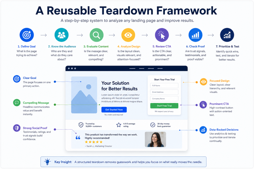
You don’t need a redesign to run this. Use this four-part pass on your own page:
- Clarity check (above the fold). Can a stranger tell what you do, for whom, and why it matters in five seconds? If not, rewrite the headline before touching anything else.
- Friction audit (the form). List every field. For each one, ask: “Do we need this before they sign up, or can it wait until onboarding?” Cut ruthlessly.
- CTA specificity. Replace generic verbs (“Submit,” “Learn More”) with outcome-oriented phrases (“Start My Free Trial,” “Get My Report”).
- Proof placement. Make sure at least one trust signal a logo, number, or testimonial is visible without scrolling.
Mini-Checklist
- Headline states a specific, believable outcome
- Form has the fewest fields possible for step one
- CTA button uses action + ownership language
- At least one trust signal is above the fold
- Page loads in under 3 seconds on mobile
A Quick Experiment Plan
If you want to test a change rather than assume it’ll work:
- Hypothesis: Reducing the form from 7 fields to 2 will increase sign-up completion rate.
- Variable: Number of form fields (control: 7, variant: 2).
- Metric: Sign-up conversion rate (visitors to completed sign-ups).
- Duration: Run until you hit statistical significance, typically 2–4 weeks depending on traffic volume don’t call it early just because the variant is ahead on day three.
FAQ
What is a landing page teardown? A structured review of a page’s copy, layout, and flow to identify specific, fixable reasons visitors aren’t converting.
What should you optimize first? Start above the fold headline clarity and form friction typically move the needle fastest and cheapest.
How do you measure small changes? Track conversion rate (not just raw sign-ups) and isolate one variable at a time so you know what actually caused the lift.
Small, unglamorous changes a shorter form, a sharper headline, a specific CTA are often what separates a page that converts at 2% from one that converts at 4%. Run the framework above on your own landing page this week, and see what a teardown turns up.