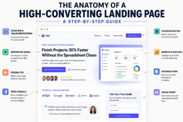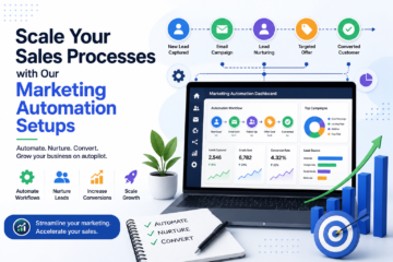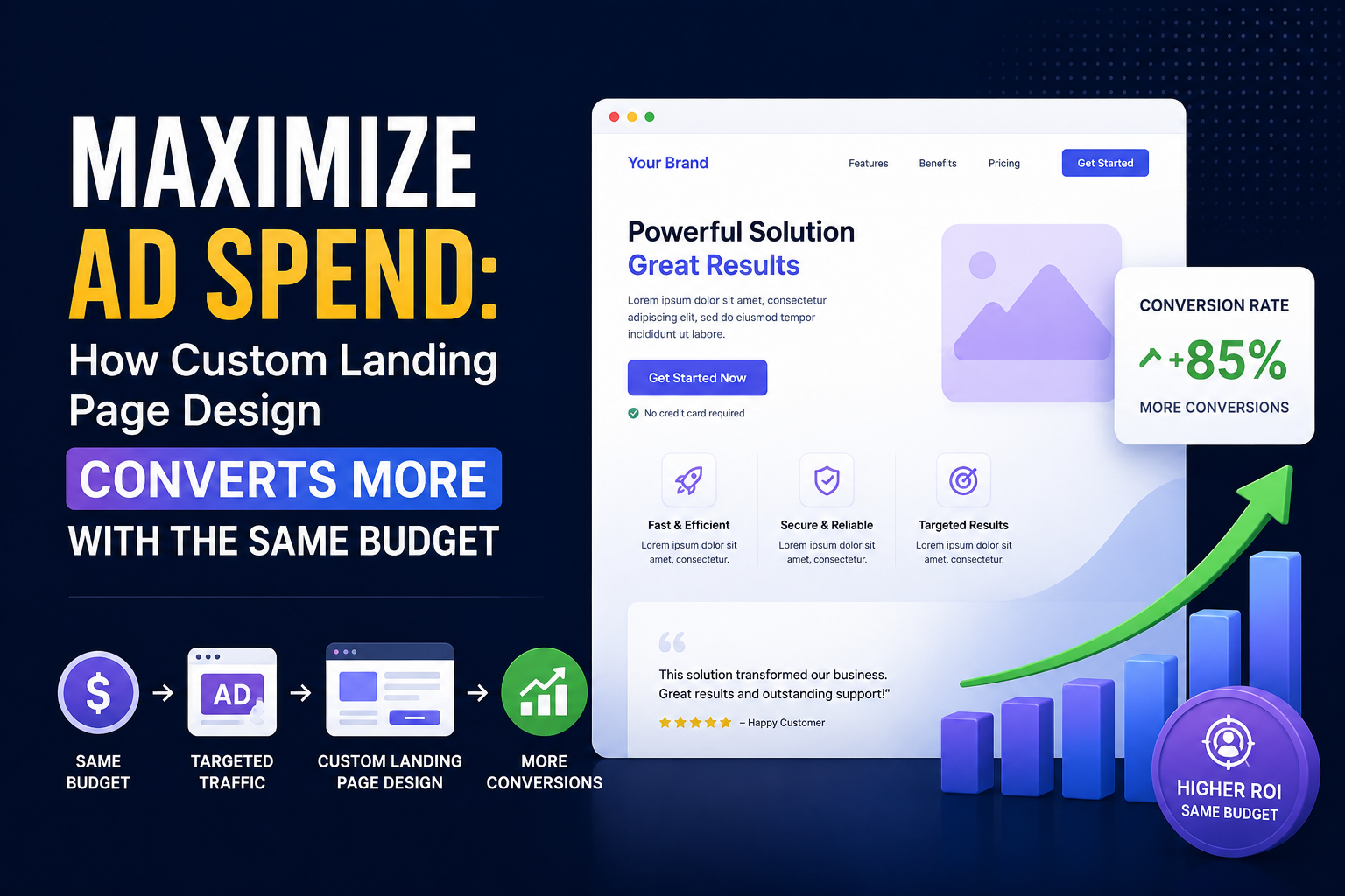

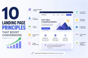
10 Landing Page Principles to Boost Conversions
Why Landing Page Improvement Matters
A landing page has one main goal: turn visitors into leads, sign-ups, or customers. Learn more about landing page optimization strategies to improve your results.
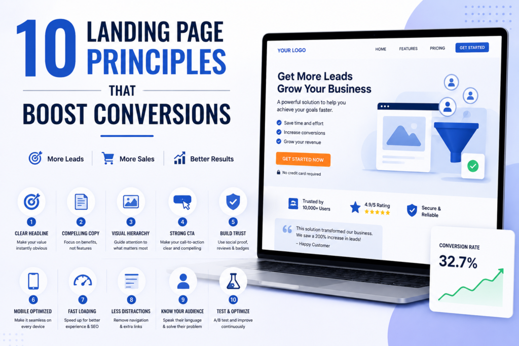
Most landing pages convert between 2% and 5%. In contrast, top-performing pages can reach 10% or more, even with the same traffic and budget.
This difference is not based on luck. A strong structure helps. Clear copy helps too. Regular testing also improves results.
This guide shares simple strategies and a checklist to help you improve almost any landing page and get better results.
Win the First 10 Seconds
Visitors judge a page within about 50 milliseconds. Research from the Nielsen Norman Group explains how quickly users form impressions and decide whether to stay on a webpage.
During these first few seconds, visitors are most likely to leave. Their interest increases only after they stay on the page for about 30 seconds.
Your main benefit should be clear right away. Visitors should understand your offer before they scroll.
To make this happen, the above-the-fold section must answer three key questions instantly:
What is this?
Who is it for?
Why should I care right now?
If visitors cannot find answers to all three questions immediately, you risk losing a big portion of your traffic before they even explore your offer further.
Write a Headline That Does the Heavy Lifting
Your headline is one of the most important parts of your page.
Most visitors read the headline first. It helps them decide whether they should stay or leave.
Weak headlines only describe the product. Strong headlines show the result users want.
A powerful headline template is:
[Achieve specific outcome] without [common pain point/objection]
For example:
“Launch your first ad campaign in a week — no coding or design skills required.”
Test 3–5 headline versions before choosing the final one. Small wording changes can create big improvements. Headlines are one of the easiest areas to improve results.
Focus on Benefits, Not Features
Your page should clearly explain the benefit users will get. Do not focus only on product features. A clear benefit shown at the top of the page helps reduce exits and improve results.
A common mistake is focusing only on features. Features explain what a product does. Benefits explain how it helps users. This message shows the result clearly. It explains how the product helps users save time.
Visitors care more about solutions than features. Show how your product can help them.
Keep Copy as Long as It Needs to Be — No Longer
For landing page copy, there is no universal ideal word count. Instead, the right length depends on the complexity of your offer and the level of commitment required.
Short copy works well for simple offers like free trials and newsletter sign-ups. Long copy works better for expensive products or services. These offers need more explanation before users decide, where visitors need additional information and reassurance before making a decision.
Therefore, the guiding principle is simple: every sentence should either remove a doubt, answer a question, or increase desire. If a sentence does none of these, it is unnecessary and should be removed.
Use One Clear CTA
To begin with, a landing page should have one clear and focused call-to-action (CTA). Pages with one clear CTA often perform better. Too many choices can distract visitors. Extra links may take them away from the main action.
Therefore, many high-converting landing pages remove the top navigation menu completely to keep visitors focused on the desired action.
A strong CTA copy method includes:
[Action verb] + [specific value] + [urgency or risk-reversal, optional]
For example:
- “Start my free trial — no credit card required”
- “Get my custom quote in 24 hours”
- “Download the checklist now”
However, avoid generic CTA phrases such as “Submit” or “Learn More” because they fail to communicate a clear benefit or reason to take action.
Use Social Proof Strategically, Not Decoratively
Social proof helps build trust. It also reduces visitor doubts. Testimonials, star ratings, client logos, and case-study results provide the trust a skeptical visitor needs before converting.
Especially for trust-sensitive offers — such as products involving money, personal data, or long-term commitments — social proof becomes even more important.
Placement is also important. Do not hide testimonials in the footer. Place them near your CTA where visitors make decisions.
The most effective types of social proof are:
- Specific, named customer results
Example: “Increased signups by 34% in 60 days — Sarah, Acme Co.” - Recognizable client logos
- Star ratings and review counts
- Generic testimonials without attribution (weakest — use sparingly)
Cut Your Form Down to the Bone
Every extra form field creates problems. Too many fields can reduce sign-ups. As a result, if your form asks for information that is not required at this step, remove it.
For example, reducing a form from five fields to three can often improve conversions significantly. In some cases, removing unnecessary fields has increased completion rates by double digits.
To decide what stays, ask yourself:
“Do I need this information to deliver value right now, or am I collecting it simply because it might be useful later?”
If it is the second option, move that information to a later stage of the customer journey.
Use Helpful Visuals
Visuals also affect how visitors interact with your page. Following Google’s Page Experience guidelines can help create a better user experience. Hero images, product screenshots, and short demo videos can increase engagement and time spent on the page — but only when they strengthen the main message.
On the other hand, generic stock images, especially those commonly seen across competitor websites, can reduce trust and make the page feel less authentic.
Small animations can also make users feel more confident. For instance, subtle button animations, progress indicators on multi-step forms, and completion checkmarks can make the page feel more responsive and professional.
As a result, these small design details indirectly support trust and encourage visitors to continue.
Add Trust Signals Early
Furthermore, trust signals should be integrated throughout the landing page rather than added only at the end. Security badges, money-back guarantees, “as featured in” logos, and clear contact information help reduce visitor hesitation.
This is especially important because many visitors will leave a website if they cannot quickly find basic trust indicators or contact details.
Therefore, place trust elements near key decision points, including:
- Beside the form
- Near pricing information
- Close to the final CTA
Avoid placing all trust signals only in the footer, where many visitors may never see them.
Test Everything, Then Test Again
Testing helps you find what works best. Tools and resources from HubSpot also highlight the importance of testing landing page elements to improve results. A/B testing shows which changes improve your page and which ones do not.
Regular testing improves results over time. The final improvement depends on your current page quality. However, many businesses still fail to test consistently, creating a major opportunity for those who do.
Basic A/B Testing Process:
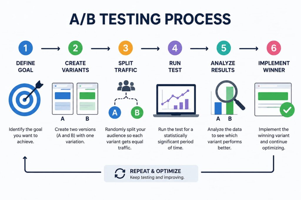
- First, choose one variable to test:
- Headline
- CTA copy
- Hero image
- Form length
- Next, create a clear hypothesis:
“Changing X will increase Y because Z.” - Then, split traffic evenly and run the test until you reach statistical significance.
(Avoid ending tests too early.) - Finally, apply the winning version and continue testing the next element.
Remember, results improvement compounds over time.
Quick Landing Page Critique Checklist
Before publishing any landing page, review it using this checklist:
Structure
- Show your main benefit before users scroll..
- Maintain one clear primary CTA without competing actions.
- Use this flow: Hook → Value → Proof → Handle concerns → CTA.
Copy
- Write headlines that show results.
- No unnecessary jargon or filler content
- CTA communicates a clear benefit
Visuals
- Images directly support the offer instead of using generic stock photos
- Page loads quickly with optimized media
Trust
- At least one specific, attributed proof point appears near the CTA
- Contact information and trust signals are visible, not hidden
Form
- Only essential fields are included
- Form appears close to the main benefit
Mini Exercise
To put these principles into practice, choose any landing page you have recently visited, such as a course page, SaaS product page, or service website.
Then:
- Rewrite the headline using the outcome-focused template.
- Rewrite the CTA using the action + value + urgency method.
- Identify one visual improvement and explain why it would help.
- Suggest one form improvement and explain its benefit.
Repeat this exercise with five landing pages. You will learn more by doing than by only reading.
The Bottom Line
In conclusion, great landing pages are not created by chance. They come from a clear structure, simple messages, and regular testing.
These simple methods can work for different offers, audiences, and campaigns. Over time, this approach will help you create landing pages that consistently attract, engage, and convert visitors.