
The Anatomy of a High-Converting Landing Page: A Step-by-Step Guide
If you have ever clicked away from a landing page within three seconds you are not alone. Most people do the thing. The average landing page conversion rate is between 2% and 5%. This means most visitors leave without doing what you want them to do. The landing pages that do better than this are not just lucky. They are built in a way that every section of the landing page does a job.
What Makes a Landing Page High-Converting?
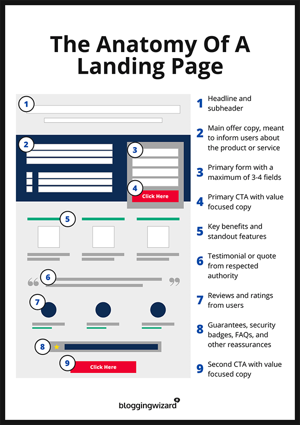
A good landing page does three things: it gets the visitors attention it makes the visitor believe in what you’re offering and it makes it easy for the visitor to take action. The important parts of the landing page are:
- The headline and value proposition of the landing page. This sets the visitors expectations.
- The call-to-action of the landing page. This tells the visitor what to do
- The. Trust signals of the landing page. These help the visitor feel safe and build trust.
- The form design of the landing page. This should be easy to use and not frustrating.
- The hierarchy of the landing page. This helps guide the visitors eye to the parts of the landing page.
Structuring Above the Fold
When people look at a landing page they make a decision in a few seconds. So the top part of the landing page the part you can see without scrolling needs to answer some questions: What is this landing page about? Who is it for? What do I do next? A good above-the- section includes a headline that tells the visitor what they will get a subheadline that explains things more a picture or video a call-to-action and something that shows you are trustworthy.
Using video on the landing page is an idea. It can increase conversions by up to 86%. Video can show the visitor what they will get faster than text and keeps them interested
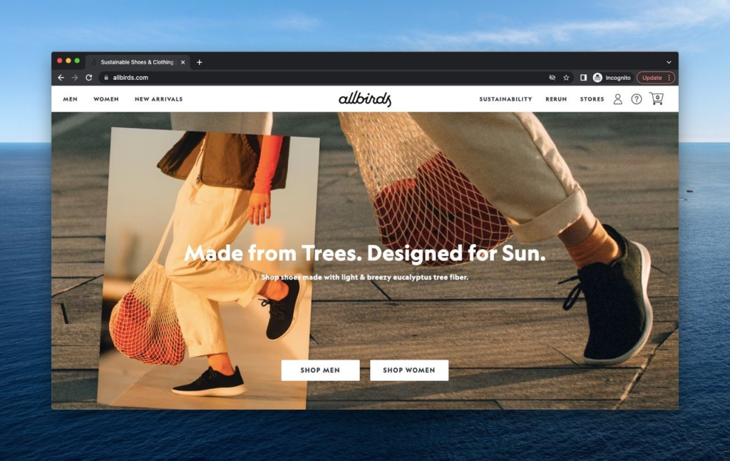
Headlines That Convert
If the headline is not good people will ignore it. The best headlines are ones that tell the visitor what they will get, like “Get Paid With Automated Invoicing”. They can also be about numbers like “Cut Onboarding Time by 40% in 30 Days”.. They can ask a question like “Tired of Chasing Late Invoices?”.
If the visitor has to think hard about what you do you have already lost them.
Bullets Over Walls of Text
Landing pages do not have to be short. They need to be easy to scan. If there is much text people will get bored and leave. Breaking up the text into bullets and short sections helps keep the visitor interested and moving down the page.
Social Proof and Trust Signals
People trust people more than they trust what you say about your product. If you have testimonials case studies or logos from customers it can help build trust. You should put these near the call-to-action or near the top of the landing page.
Form Optimization
Every extra field on a form makes it less likely that people will fill it out. Keep it simple:
- Only ask for what you need.
- Use a column layout.
- Label the fields clearly.
- Make the submit button say what it does like “Get My Free Audit”.
The Call-to-Action
If the call-to-action is not clear people will not do what you want them to do. You should use action-oriented language like “Start My Free Trial” of “Submit”.
You should repeat the call-to-action least twice on the landing page once at the top and once after you have given the visitor some proof.
Mini Case Study
There was a landing page with a headline that just said “Welcome to TaskFlow” and a call-to-action that said “Submit”. It did not do well only converting 1.8% of visitors. Then they changed the headline to “Finish Projects 30% Faster Without the Spreadsheet Chaos”. The call-to-action to “Start My 14-Day Trial”. This increased conversions to 3.4%. They did not change the product the way they presented it.
What to Test First
You should test the headline and call-to-action first. Then you can test the picture or video the length of the form and the order of the sections. You should only test one thing at a time. Let it run long enough to get a good idea of what works.
Quick Optimization Checklist
- The headline of the landing page should be clear and specific.
- The picture or video should be shown at the top.
- The call-to-action should be visible without scrolling.
- The call-to-action should be action-oriented.
- There should be something that shows you are trustworthy at the top.
Final Takeaway
A good landing page is made up of small decisions. You should have a headline, a simple form proof that you are trustworthy and a call-to-action that is easy to understand. You can use the checklist above to make your landing page. Test one thing, at a time. See what works.